Tips for Choosing Photos
General rules for choosing photos for marketing material:
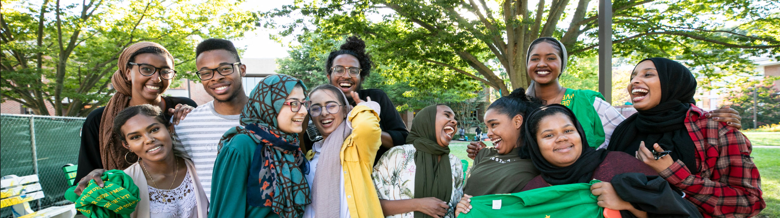
- Use photos of Mason students from the Mason Photo and Video Library in marketing collateral whenever possible
- Select high-resolution photos that work with the composition of your final deliverable
- Avoid posting screenshots. They will look blurry, pixilated, and unprofessional
- Images on websites may have a low-resolution so saving them may also result in blurry photos
- If you have a photo that, in its original form, does not fit the intended dimension (too thin, too wide, too small, etc.), choose a different photo. Resizing the photo to fit may distort the photo and the final product will not look professional
- Photos should be clean and vibrant without distracting backgrounds
- Photos used in marketing and communications should represent the diverse populations of Mason students
Graphic Design Best Practices
- Simplicity is critical to great design. Simple designs remove distractions and highlight critical information.
- Your goal should be to provide the audience with just enough information to help them decide whether they will engage with your event, service, or resource.
- Only include key points rather than lots of details in your design.
- As a general rule, use a maximum of three fonts per design. Use serif and san-serif fonts to help distinguish groups of information.
- A simple rule when using multiple font types is to use one novelty font for headings and a regular font for the body text.
- You can create pairings by using different text weights within a font family. For example, use Montserrat bold for the heading, Montserrat italics for subheadings, and Montserrat regular for text blocks.
- Always check for readability before choosing your fonts.
- Visual hierarchy designates the importance of specific elements over the other content. In simple terms, it’s why headers are larger than subheadings, and subheadings are larger than a body text.
- The same applies to images, graphics, icons, and even colors. When you leverage the rules of visual hierarchy, you draw attention to a focal point in the design. This creates a visual balance that results in a visual flow of information for the audience.
- White space (which isn’t always the color white) refers to empty spaces within a design where the project “breathes”. This is one of the design techniques that is harder to master than others.
- Studying minimalist design is a great way to learn how to use white space. This concept is centered around the idea that “less is more” and the belief that graphics should only include the bare necessities.
- Good spacing is one of the most important tools when it comes to creating balanced compositions. Be intentional with your margin spacing as well as with spacing between shapes, paragraphs, lines, words, and even letters.
- Space is essentially white space, as mentioned above. The difference is that in this case, it acts as a rule to help you align and balance elements in a way that allows the elements to complement each other.
- Always make sure your text easy to read. This applies to when you overlay text on backgrounds, the colors and fonts you use for headings, and how elements relate to the text and flow of the design.
- Choose the best typeface for your project, one that matches your message and is readable. Ensure that the text is easy to read over a background image or texture.
- Never start a project without knowing the exact size of the deliverable. Even though you can change the size later, you’ll have to readjust everything to fit into the new size. For example, if you need to create a presentation, don’t start with a vertical infographic size. Likewise, when creating a set of social media posts, make sure documents are square, landscape or portrait following the optimal dimensions listed below.
Social Media Graphics – Best Practices
Apply these best practices when creating social media graphics:
- For posts promoting events, always include:
- Name of event
- Date
- Time
- Location
- Registration information such as a custom short link to Mason360
- Create free custom short links on bitly.com
- Create a free account
- Click the orange ‘Create’ button at the top of the site (next to the search bar)
- Paste the URL you would like to shorten
- Customize the back half of the link in the ‘Customize Back-Half’ text box
- Add a title for performance tracking purposes (including information such as where and when you posted the link)
- Click ‘Save’
- Avoid adding QR codes to social media posts since the audience will need an additional phone to scan the QR code. This will result in a cleaner design
- Avoid pasting paragraphs of text into social media graphics or captions; instead, use bullet points starting with action verbs
- Try to use photos instead of text-based graphics for a more visually appealing post
- Include a Mason-approved logo for Mason-sponsored events, resources, and information
- Create graphics with dimensions specific to each social media platform